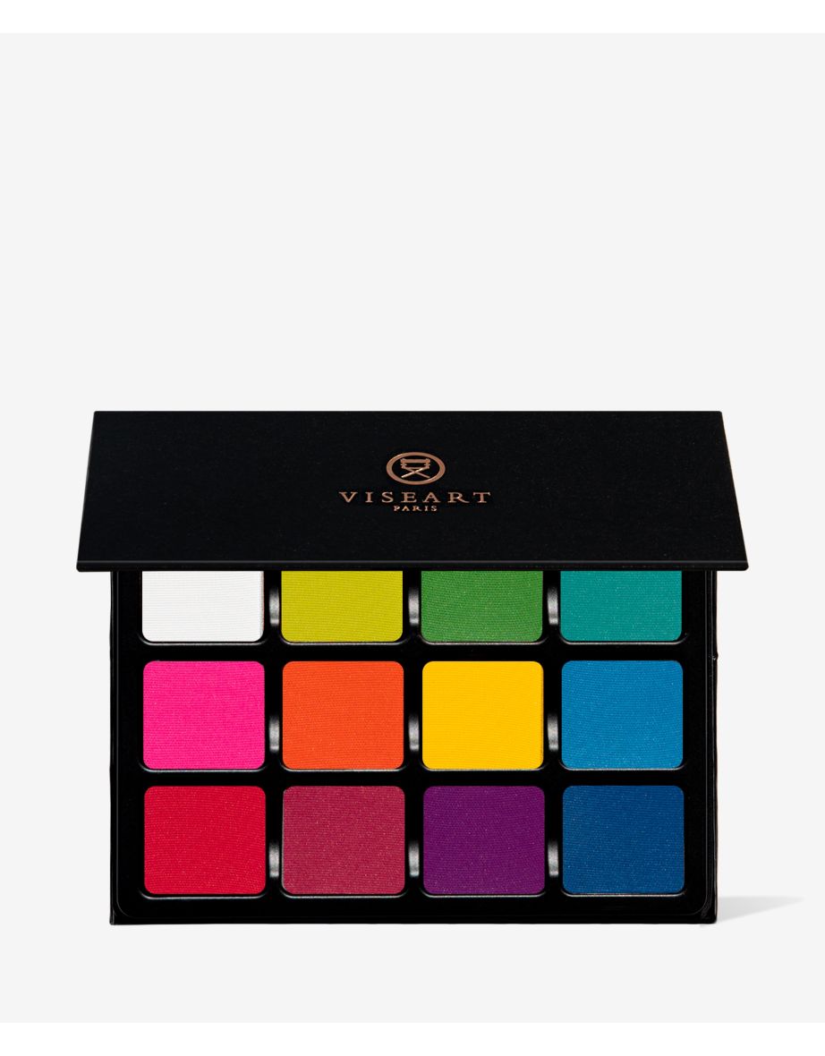
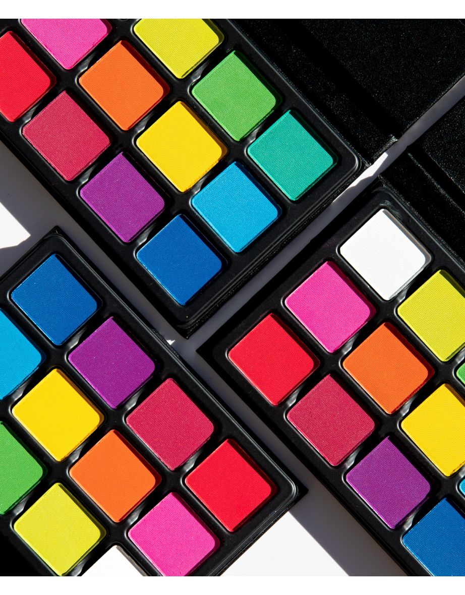
- Shade 1 - White: This can be mixed with any of the other colors to make pastels, or blended in as a matte opaque color. - Shade 2 - Lime: This is a tertiary color, as it’s a yellow-green, Mix with white to make pale lime, or with Clover to intensify the depth of the green. This color is also analogous to both blues and yellows. - Shade 3 – Kelly: This is a secondary color, mix with white to make pale green, with yellow to make a lighter green, or with blue to make Teal. - Shade 4 – Aqua: This is a tertiary color, it’s a blue-green. Mix with white to make anything from pastel teal to turquoise. - Shade 5 - Pink: A tertiary color, mix with white to make anything from pastel to bubble gum pink, or use to brighten up blue and green eyes. This can also be used on cheeks, or mix with a blush that’s too light to intensify it. *WARNING* - In the US, this shade contains pigments that the FDA has not approved for use in the eye area. - Shade 6 - Orange: A secondary color, mix with white to make anything from a pale orange to pastel. Orange is amazing against blue eyes, or use analogous colors with it, like Red and Yellow. *WARNING* - In the US, this shade contains pigments that the FDA has not approved for use in the eye area. - Shade 7 - Yellow: A primary color, which makes it ultra versatile. Mix with white to make anything from pastel to buttercup! You can also blend with orange to intensify the yellow, or blend with red to change the depth of the orange. - Shade 8 - Periwinkle: A tertiary color, Mix with white to range from pastel to sky blue, or use with analogous colors like purples or greens. - Shade 9 - Red: A primary color, Mix with white to make multiple shades of pink, or blend out to create purples, browns, oranges and more. *WARNING* - In the US, this shade contains pigments that the FDA has not approved for use in the eye area. - Shade 10 – Raspberry: This is a tertiary color, it is a red-violet. It’s fantastic against brown or hazel eyes to brighten, but is a super versatile color with almost every eye shade. *WARNING* - In the US, this shade contains pigments that the FDA has not approved for use in the eye area. - Shade 11 – Grape: This secondary color can be made into pastel simply by mixing with white. This is also super versatile for every eye color to intensify. *WARNING* - In the US, this shade contains pigments that the FDA has not approved for use in the eye area. - Shade 12 - Azure: This is a primary Blue, Mix with white to make a pastel blue, or use dramatically for anything you can think of. This can be used for liner, lid, crease - the sky's the limit. Blue is also a wonderful color to brighten Brown and Hazel eyes.
Ingredients:
Shade 1 (White): Talc, Mica, Octyldodecyl Stearoyl Stearate, Octyldodecanol, Zinc Stearate, Octyldodecanol, Potassium Sorbate, Sodium Benzoate. Shades 2 (Lime), 3 (Clover), 4 (Aqua), 5 (Pink), 6 (Orange), 7 (Yellow), 8 (Periwinkle), 9 (Red), 10 (Raspberry), 11 (Grape), 12 (Azure): Talc, Mica, Octyldodecyl Stearoyl Stearate, Zinc Stearate, Octyldodecanol, Potassium Sorbate, Sodium Benzoate. (+/- may contain: Yellow 5 CI 19140, Titanium Dioxide CI 77891, Blue 1 CI 42090, Red 28 Cl 45410, Red 6 Lake CI 15850, Red 7 Calcium Lake CI 15850, Ferric Ferrocyanide CI 77510, Red 40 CI 16035, Iron Oxides CI 77492/CI 77499). Vegan.
A 12-pan, matte eyeshadow palette. Go wild when it comes to your eye makeup looks with the Viseart Editorial Brights VisePRO. Ideal for editorial looks, this palette boasts a selection of white, green, pink, yellow, orange, red, purple, and blue-hued eyeshadows in buttery matte and pigment-rich formulas. Bringing you a range of bold and bright shades, this palette is perfect for adding a pop of pigment to your eyeshadow looks, creating striking graphic eyeliner designs, and so much more. Thanks to its zero-plastic easel-folio cover with a removable, modular compact capsule and interchangeable magnetic pans, this palette lets you switch up and customise for on-the-go glam.__Shade breakdown:__- White: Bright white with a matte finish- Lime: Neon yellow green with a matte finish- Kelly: Bright green with a matte finish- Aqua: Bright aqua with a matte finish- Pink: Bright fuchsia pink with a matte finish- Orange: Primary orange with a matte finish- Yellow: Primary yellow with a matte finish- Periwinkle: Cyan blue with a matte finish- Red: Neon red with a matte finish- Raspberry: Bright raspberry with a matte finish- Grape: Bright magenta purple with a matte finish- Azure: Cerulean, blue with a matte finish

 Bahrain
 Bahrain
 Egypt
Egypt Iraq
Iraq Jordan
 Kazakhstan
 Libya
Libya Oman
Oman Qatar
Qatar Saudi Arabia
 United Arab Emirates